There is a very steep learning curve when it comes to using Gale, and that is mostly due to how many different steps there are to the text analysis process. Even more so, the algorithms used to analyze the text tend to be a bit strange. I ended up with a lot of odd results, and I couldn’t tell if it was the less than reliable OCR or the clean up settings not being what I expected. Most times I ended up with no text to analyze. I don’t know how comfortable I am teaching this program to someone else, because I can’t tell what causes certain things to happen, and there is little to no visual feedback from Gale to tell me as much.
Week 4 Reflection
I found ArcGIS to be one of the more frustrating pieces of software we’ve worked with so far, but also the most fascinating. It is definitely a lot more interactive with how it displays its data, and I think that is so much more interesting than what we’ve done so far with Omeka. The level of customization with layers is very cool, and if datasets are big enough, the map can translate a wealth of visual information very quickly.
That said, actually using it with certain datasets is very limiting. There’s no way that I’ve found to change the location a blip is set to from within ArcGIS. This would make sense for data using exact coordinate locations, but when I tested this with a dataset that used city names, the program picked a place and stuck with it. These places were, more often than not, incorrect despite the city name being entered correctly in my data sheet. Using ArcGIS reliably would require the knowledge of coordinate points in respect to the location you’re aiming for, though this would be a challenge for data that was vague in its location in the first place.
Week 3 Reflection
When it comes to using Omeka, I found the process fairly easy since the interface is so user-friendly. I did struggle a little bit with downloading a theme/plugin, but I feel that had more to do with the theme itself than navigating the domain’s file manager. I do think I could teach someone the basics of adding items and exhibits, and maybe provide some guidance on how to fill out fields. I thought the exhibits themselves were a pretty interesting way to organize any related objects for users to see, and I would love to dive more into that.
Week 2 Reflection
Through Excel PivotCharts, data was automatically visualized through a bar chart. It made comparing multiple data sets of numerical values convenient, but that was about all it did. I wish there was support for something like a pie chart, where you would just put in a single field and Excel would get the percentage of times a certain value was repeated compared to others. This also doesn’t take into account data types that are not numeric.
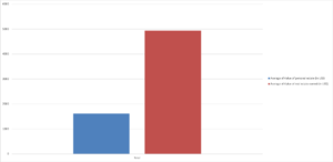
Additionally, because the scale and axes of the graph are automatically generated, this creates distortion in how values are perceived based on size. An obvious example is the tutorial with this data set that compared average male and female householder ages. The graph displayed bars with the male ages being twice the size as the female ages, leading one to believe that there was a massive difference. In actuality, the difference was only about 3 years. This is actually something I’ve noticed across data presentation as a whole. A lot of people are not careful about how they create their graphs, or they are intentionally creating graphs with correct information but misleading presentation.
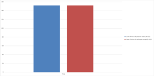
It was very hard to create a graph that the PivotChart actually wanted to give me information for, mainly for the reasons I listed above. But I was able to generate this graph of average value of personal estates vs. real estates. Interestingly, Excel defaulted to counts of the amount of cels with values in them rather than sums like it did before (possibly because of some inconsistent labeling of cels where no data was available). I didn’t notice this at first and assumed I was looking at counts, so the difference in the visual of the two graphs caught me off guard at first, because I wasn’t such a drastic change.