I focused the training on the Exhibits. I apparently already had one that I tested out so I tried to add more to it. Using the exhibits to display the pages is pretty straightforward, but I did struggle with some of the settings. Beyond that, Omeka is still pretty easy for me to use, and I found the experience of revisiting it pretty helpful. I am unsure if it will be an option for my current project in the future, but I will still keep my eye on that in case we decide a new webpage is the best course of action.
Week 10 Reflection
After working with Voyant for a little bit, I found that I prefer it over the Gale Scholar lab. I think the main reason is the interface is a lot more organized. Rather than putting the tools into multiple different pages, Voyant organizes as much as it can into one screen. While that doesn’t seem very intuitive, I feel Voyant can get away with this because it highlights the more important tools to the workflow such as the word visualizers and the summaries, while leaving less used tools or settings in tabs that the user would only access if they needed to. I also think the visualizations themselves are easier to understand since they default to formats that allow a user to process the information quickly. It’s like the difference between looking at a bar graph and looking at a table of data. In general, Voyant seems a lot more compact than Gale, which also means it doesn’t have as many tools as Gale and doesn’t processes as many file formats (I could be wrong, but I’m sure that Gale could process text from images. Maybe they were just pdfs). But I feel Voyant is also a little more accurate with the text it’s detecting.
Week 9 Reflection
Learning StoryMaps was actually pretty fun. I noticed the general layout is very similar to a blog, but there are so many more embeds you can add that really increase how much interactivity there is. It’s been very simple to use, so I think I could teach others how to use it. Honestly the amount I could do with it is so cool that I would consider using it on my own outside of Vivero. However, I wish the level of data displays carried over into the design aspect. There aren’t a lot of options for the overall theme of the story map, at least not at a first glance.
Update: I actually went back and found the theme creator, and it’s just as easy to use as the story maps. So yeah, I really like this program.
Week 8 Reflection
Learning to use WeVideo was probably the easiest tool so far. I think that’s in part because I have some experience with video editing, and WeVideo is structured very similarly to iMovie. There are some things that are strange to me, though. The audio editing was pretty unintuitive, and if there was a way to add multiple audio tracks at once I couldn’t find it. Still, I think I would be pretty confident in helping students with this. It’s a very simple editing tool that wouldn’t take to much time to learn in-depth.
Mid Semester Reflection
Despite the theater department archive project only being a thing since the start of this semester, I feel my leads and I have covered a lot of ground. I would say we are still in the planning stages for the project, since we do not have any direct courses of action as of yet, but we are working on ways to accomplish our major goals. Those being figuring out where to put the images, and digitizing the images that need it. As of now, we are looking into potential technology to digitize the photo slides we have available, and we’ve narrowed down our options to the specifications we need. It’s just a matter of finding one that works and purchasing it, which I think shouldn’t take long at all. However, the other goal I mentioned isn’t quite as in reach. Finding a suitable way to host the archive was one of my first tasks when I joined. We figured our best bet was hosting the archive through the communications and marketing department, since they also take a lot of the photos in productions. However, after meeting with the campus photographer, things with that department don’t seem too suitable for us at the moment. That can change with the possibility of them moving to a new content manager, but a goal like that is not guaranteed. As of now, this endeavor has been put on hold and we shifted our focus to digitizing. Our next steps will be going through and digitizing the slides we have once we have our scanner. We still have to work out a place to save those digital copies, but I think OneDrive is our go-to at the moment.
Week 6 Reflection
During this exercise, I realized documentation really prioritizes accessibility for outside participants in the project over just recording the project over time (though of course this is important too). This method of documentation really serves to make sure other people can continue a project without worrying about the proper methods to continue the work. For good documentation to happen, it’s important that all members of the project understand their needs and methods of organization when they do documented. In the event that someone still has questions, the project managers or other contributors can step in to clarify and even edit the documentation if needed.
Currently my project is relying a lot of researching methods to help complete project tasks. If anything, I would need to document my ideas and sources for these methods so when it comes time to pick the best route, I have all the possibilities in hand. Later on, as we move toward digitizing and gathering metadata, we would need to work on documenting what metadata we’re saving and how to save it.
Week 5 Reflection
There is a very steep learning curve when it comes to using Gale, and that is mostly due to how many different steps there are to the text analysis process. Even more so, the algorithms used to analyze the text tend to be a bit strange. I ended up with a lot of odd results, and I couldn’t tell if it was the less than reliable OCR or the clean up settings not being what I expected. Most times I ended up with no text to analyze. I don’t know how comfortable I am teaching this program to someone else, because I can’t tell what causes certain things to happen, and there is little to no visual feedback from Gale to tell me as much.
Week 4 Reflection
I found ArcGIS to be one of the more frustrating pieces of software we’ve worked with so far, but also the most fascinating. It is definitely a lot more interactive with how it displays its data, and I think that is so much more interesting than what we’ve done so far with Omeka. The level of customization with layers is very cool, and if datasets are big enough, the map can translate a wealth of visual information very quickly.
That said, actually using it with certain datasets is very limiting. There’s no way that I’ve found to change the location a blip is set to from within ArcGIS. This would make sense for data using exact coordinate locations, but when I tested this with a dataset that used city names, the program picked a place and stuck with it. These places were, more often than not, incorrect despite the city name being entered correctly in my data sheet. Using ArcGIS reliably would require the knowledge of coordinate points in respect to the location you’re aiming for, though this would be a challenge for data that was vague in its location in the first place.
Week 3 Reflection
When it comes to using Omeka, I found the process fairly easy since the interface is so user-friendly. I did struggle a little bit with downloading a theme/plugin, but I feel that had more to do with the theme itself than navigating the domain’s file manager. I do think I could teach someone the basics of adding items and exhibits, and maybe provide some guidance on how to fill out fields. I thought the exhibits themselves were a pretty interesting way to organize any related objects for users to see, and I would love to dive more into that.
Week 2 Reflection
Through Excel PivotCharts, data was automatically visualized through a bar chart. It made comparing multiple data sets of numerical values convenient, but that was about all it did. I wish there was support for something like a pie chart, where you would just put in a single field and Excel would get the percentage of times a certain value was repeated compared to others. This also doesn’t take into account data types that are not numeric.
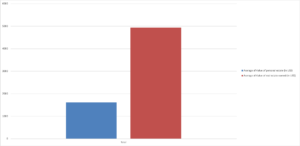
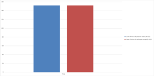
Additionally, because the scale and axes of the graph are automatically generated, this creates distortion in how values are perceived based on size. An obvious example is the tutorial with this data set that compared average male and female householder ages. The graph displayed bars with the male ages being twice the size as the female ages, leading one to believe that there was a massive difference. In actuality, the difference was only about 3 years. This is actually something I’ve noticed across data presentation as a whole. A lot of people are not careful about how they create their graphs, or they are intentionally creating graphs with correct information but misleading presentation.
It was very hard to create a graph that the PivotChart actually wanted to give me information for, mainly for the reasons I listed above. But I was able to generate this graph of average value of personal estates vs. real estates. Interestingly, Excel defaulted to counts of the amount of cels with values in them rather than sums like it did before (possibly because of some inconsistent labeling of cels where no data was available). I didn’t notice this at first and assumed I was looking at counts, so the difference in the visual of the two graphs caught me off guard at first, because I wasn’t such a drastic change.